CANTIN
CASE
Create a identity for Malmos new container street food court.
CONCEPT
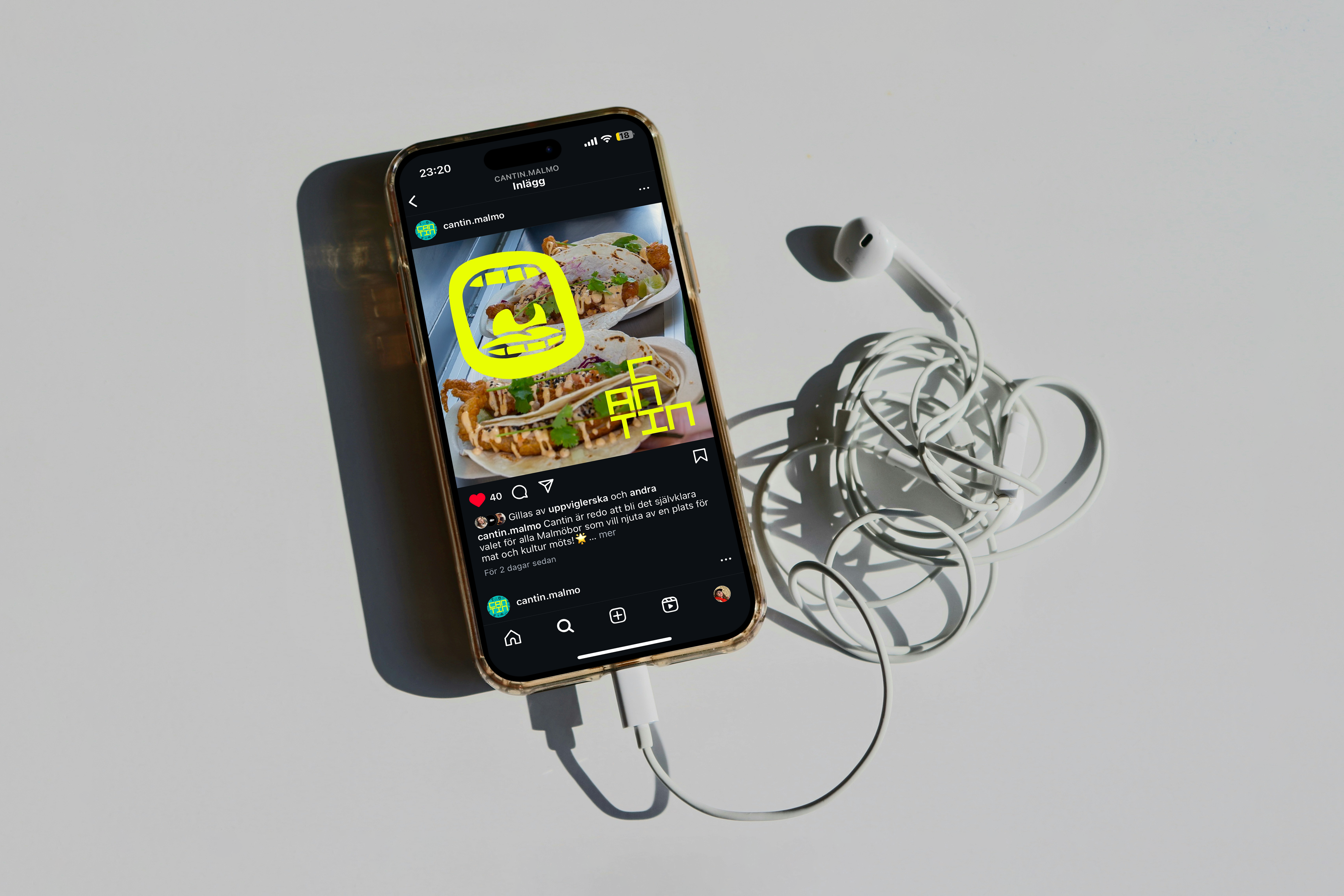
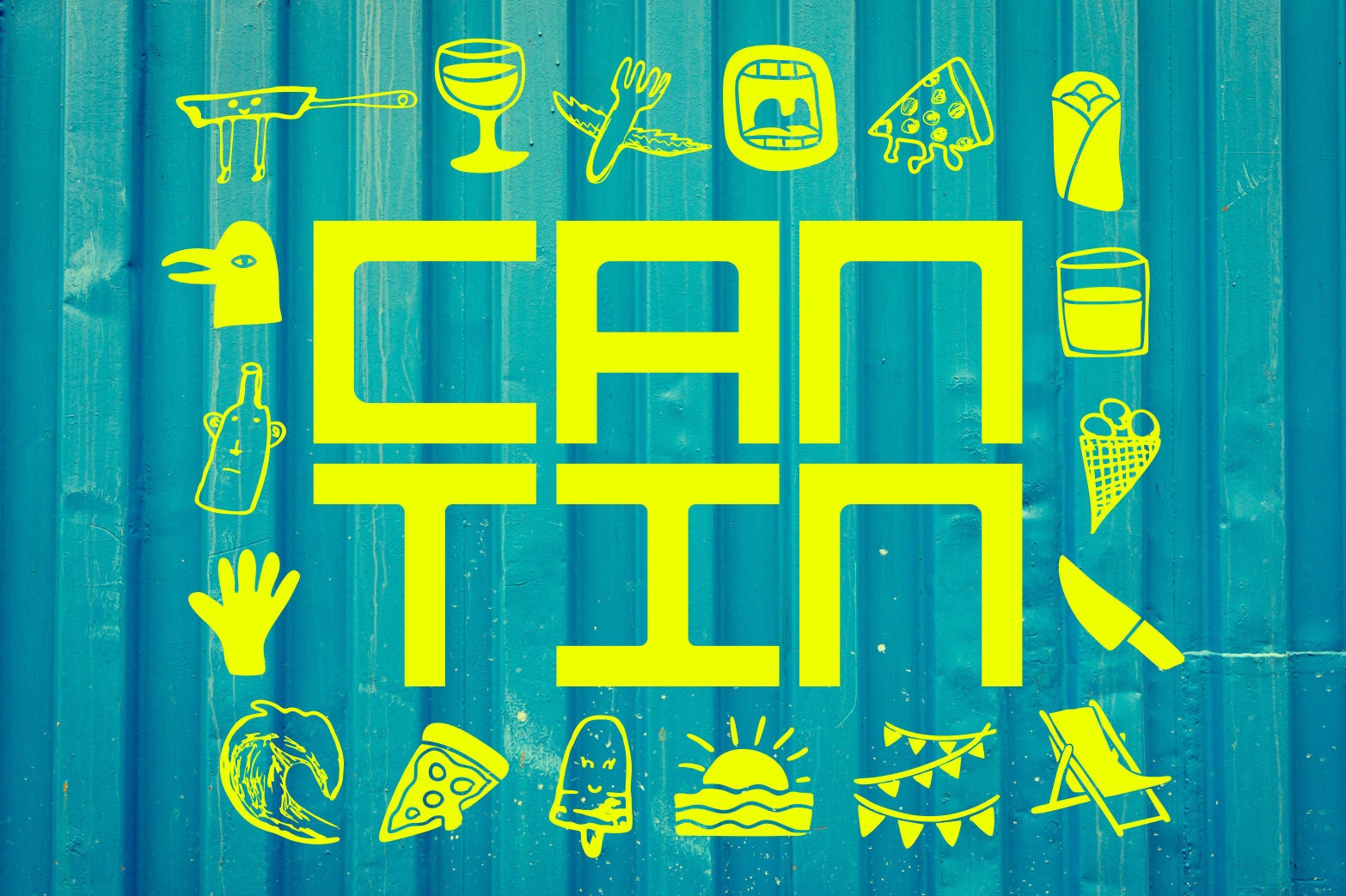
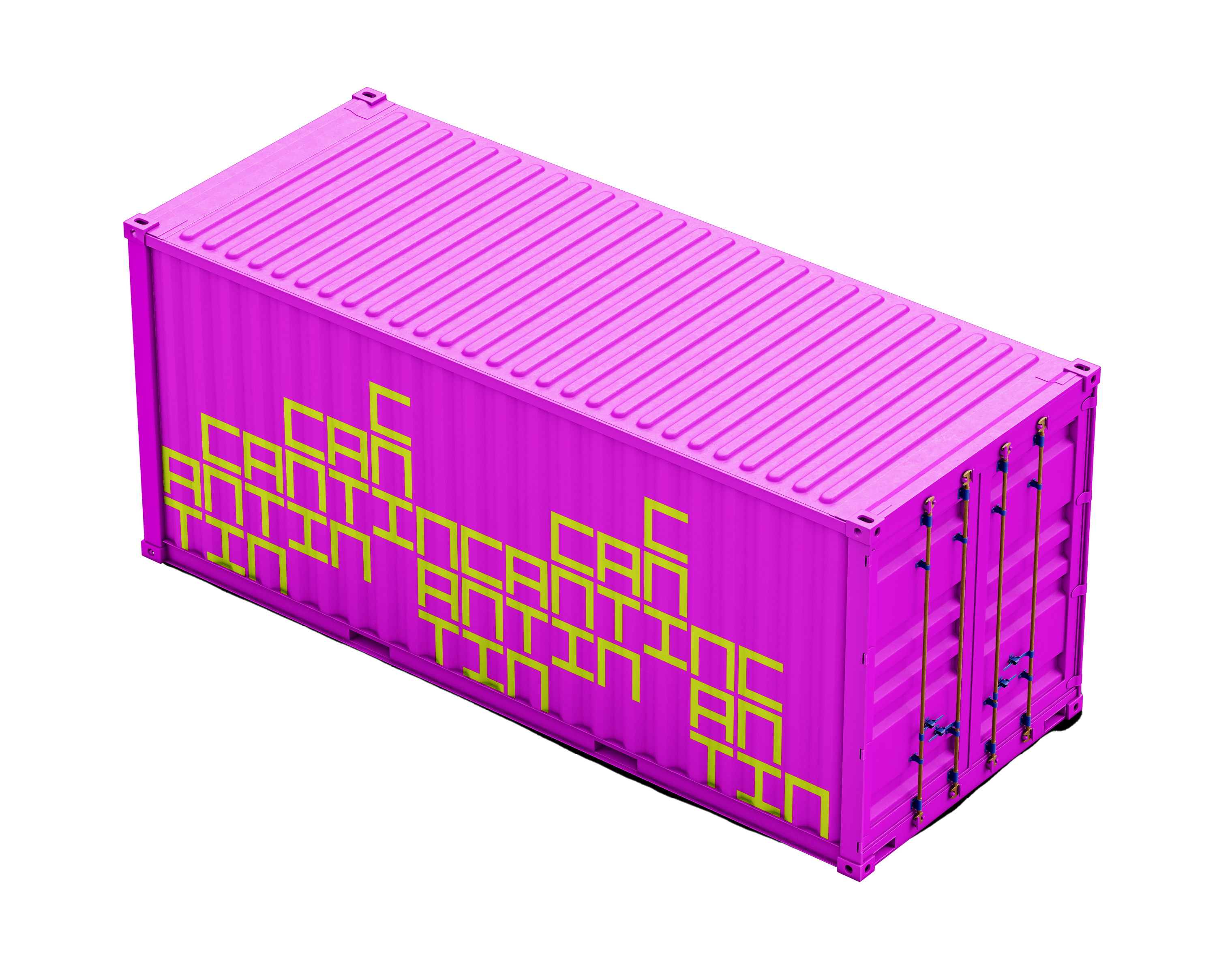
I drew inspiration from the form of a container, using it as the foundation for the logo. The design features stacked containers, which can also be developed into a dynamic pattern. To reflect the essence of Malmö, I integrated organic elements and hand-drawn symbols, aiming to convey a sense of diversity and playfulness.
The concept is meant to evoke a vibrant and adaptable identity for Cantin, blending structured and fluid components to represent both functionality and creativity in the brand.
INFORMATION
February 2025
WHAT I DID
Strategy
Design concept
Identity
Graphic design
February 2025
WHAT I DID
Strategy
Design concept
Identity
Graphic design

Logotype
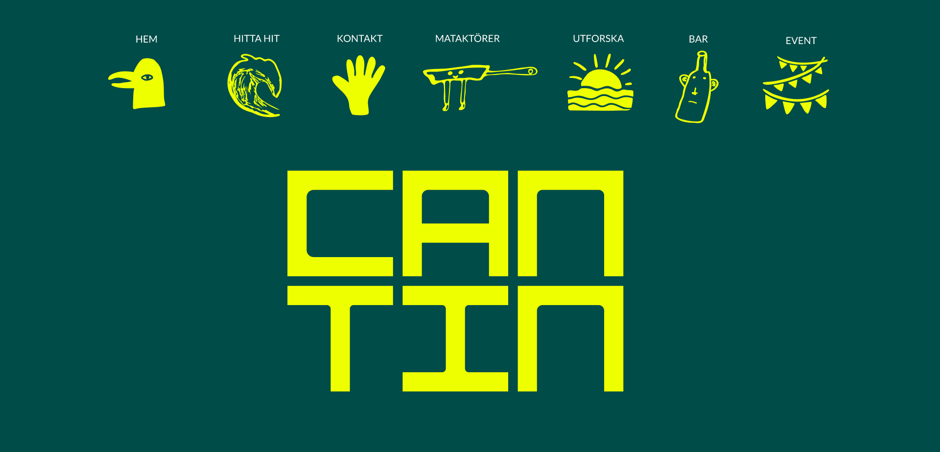
The logotype is designed inspired by a container, a square base with sharp edges on the outside and soft on the inside. To manifest the diversity Cantin will be – A place that has it all.
The logotype is designed inspired by a container, a square base with sharp edges on the outside and soft on the inside. To manifest the diversity Cantin will be – A place that has it all.
The logo can be displayed in both horizontal and vertical orientations for maximum flexibility, which is rooted in the versatility of the container.


Typeface
The design of the headline font is derived from a square that interacts with our base shape from the container, where sharp right angles meet a soft curve. The body text uses a classic sans serif, where the ends of the letters balance both straight angles and soft curves.
The design of the headline font is derived from a square that interacts with our base shape from the container, where sharp right angles meet a soft curve. The body text uses a classic sans serif, where the ends of the letters balance both straight angles and soft curves.
Pattern
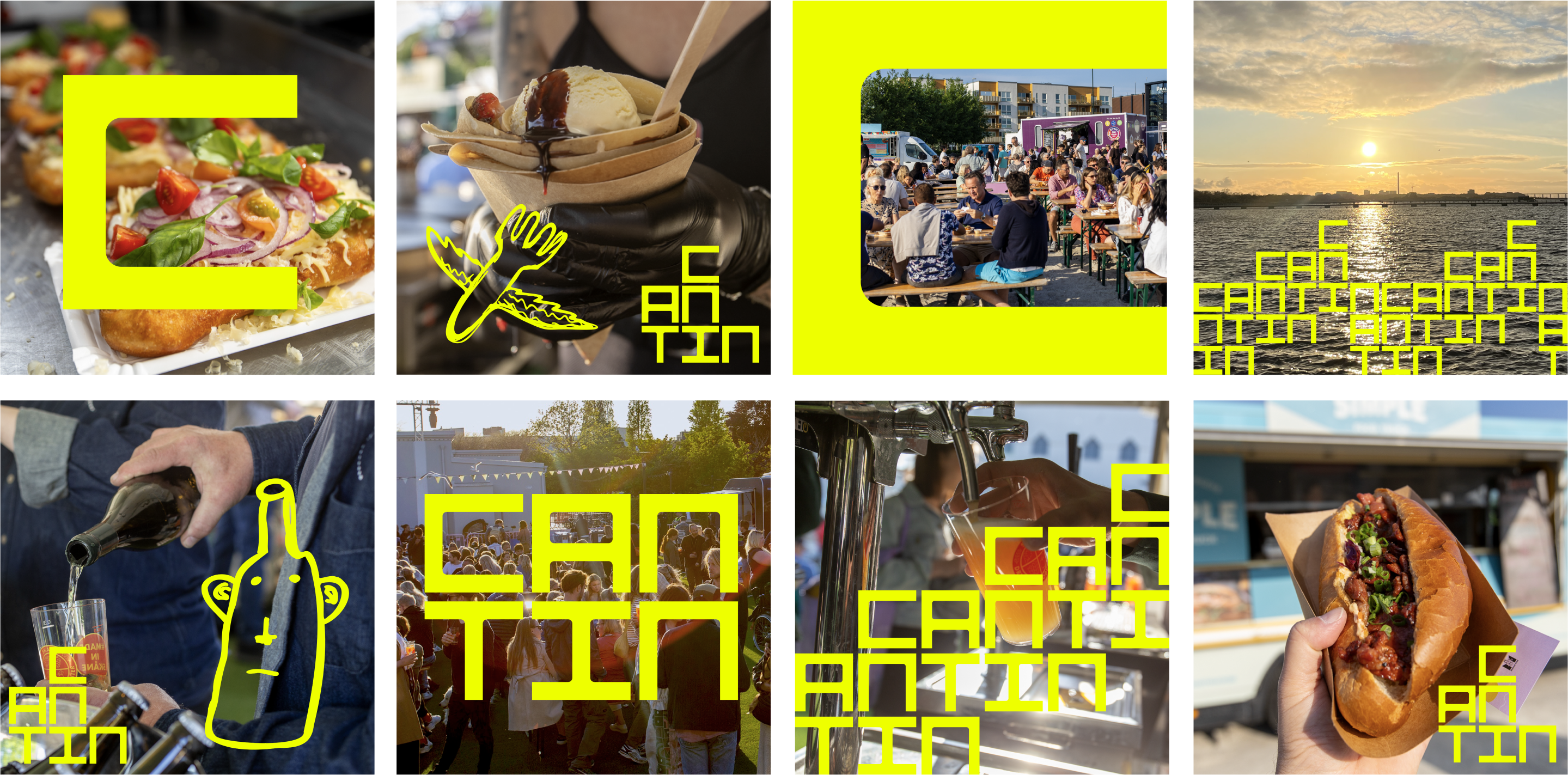
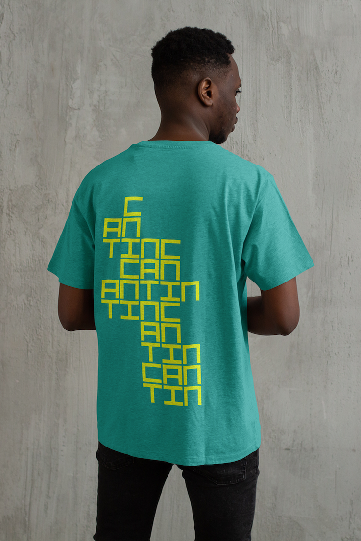
Since the letters of the logo are based on the shape of a container, I have created a pattern where they are stacked on top of each other, reflecting the fundamental principle of containers — that they are designed to be stacked.
Since the letters of the logo are based on the shape of a container, I have created a pattern where they are stacked on top of each other, reflecting the fundamental principle of containers — that they are designed to be stacked.
You can still read the name 'Cantin,' but the logo becomes more of a word image that can be used as a pattern on merchandise and on the walls of the containers


