Pure effect
CASE
Create a visual identity and design for Pure effect.
A company who makes a textile mist based on biotechnology. Create a design system that clarifies what the product is and what it can achieve.
CONCEPT
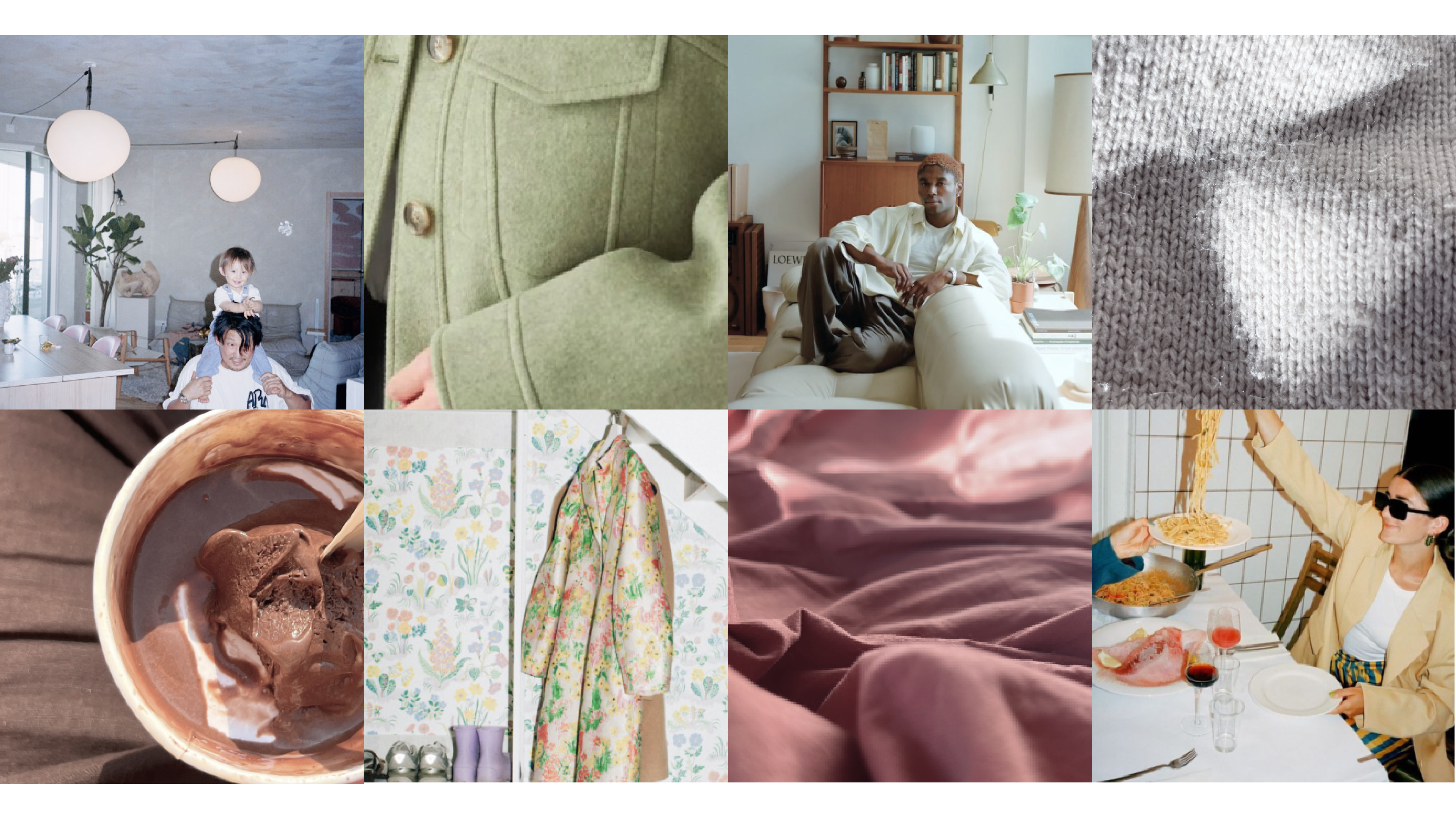
We have drawn inspiration from the first pioneer on Earth – the microorganism. A radical change in lifestyle isn’t necessary to incorporate bacteria into daily life. The small shift in routine is expressed through changes in colors and shapes.
Logotype
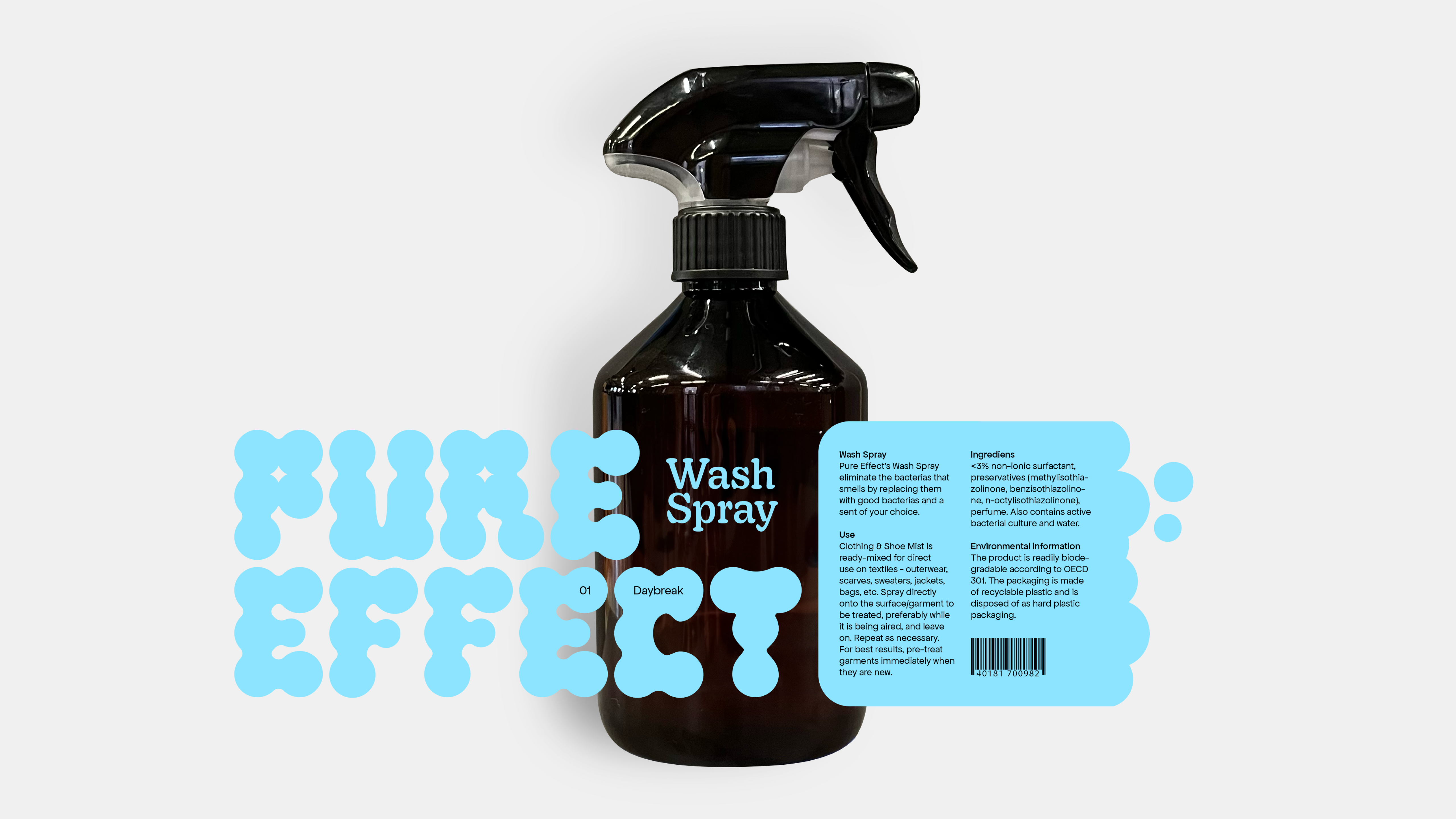
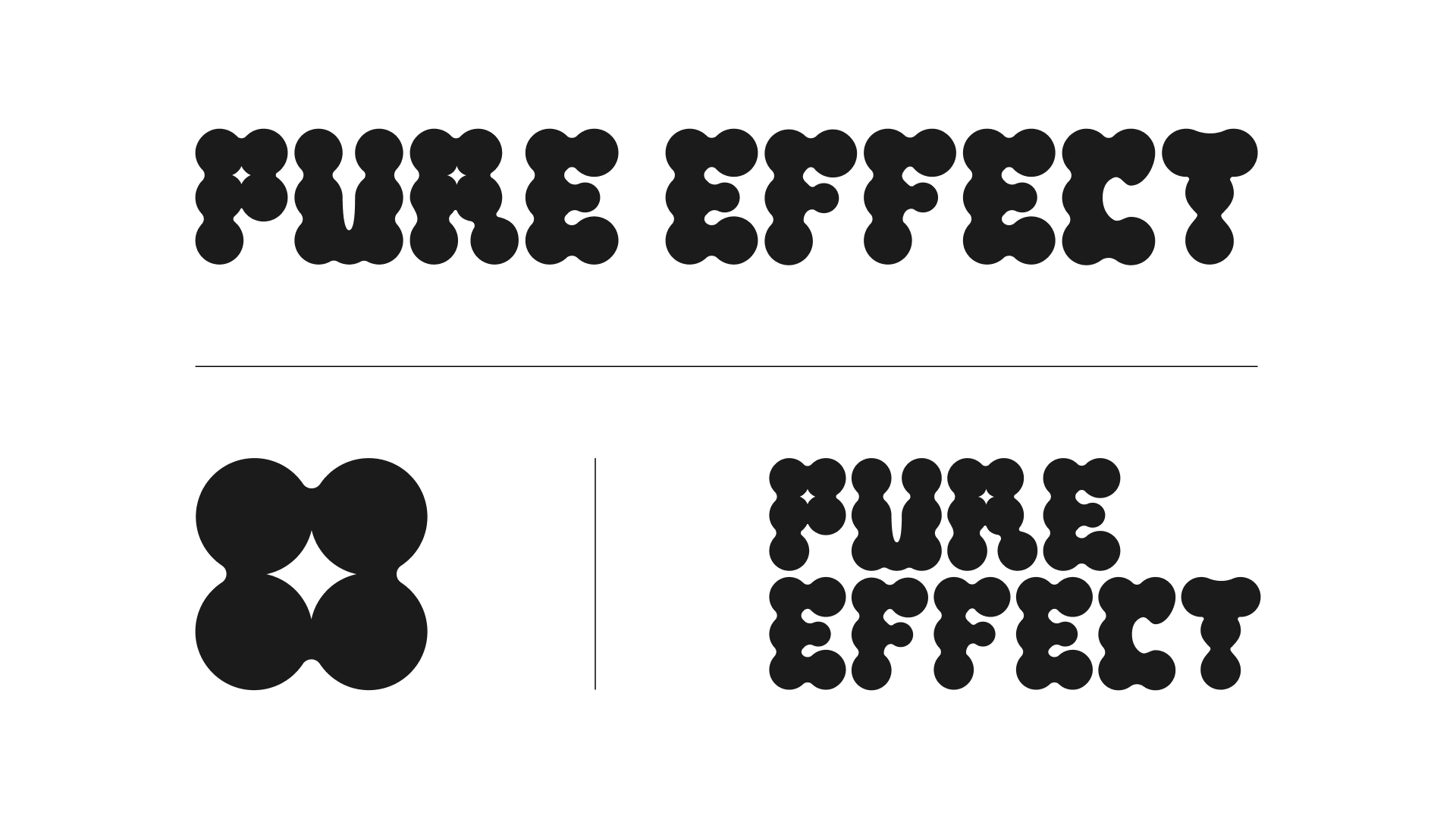
The logo takes its form from the very first pioneer on Earth – the microorganism. Inspired by the view through a microscope, it reflects the sense of growth happening step by step, much like bacteria multiplying. Out of this, a star subtly appears –
a symbol of cleanliness and a representation of
Pure Effect as a guiding star.
Typography
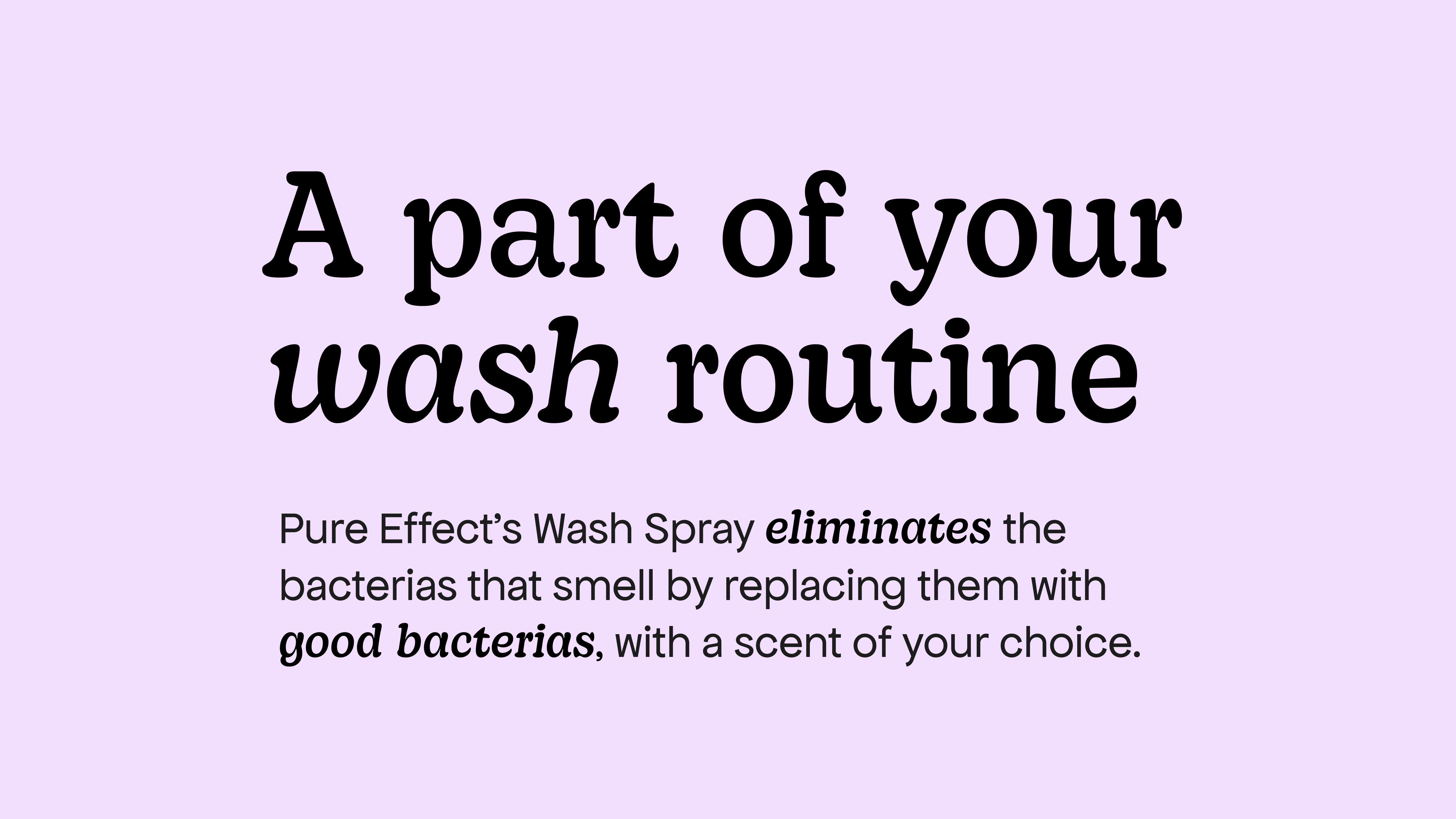
We’re transitioning from the bubbly logo to a headline font with soft serifs, complemented by a clean sans serif, with the circle serving as the core shape. The sans serif can be used on its own for body text or paired with the serif to add emphasis.
We’re transitioning from the bubbly logo to a headline font with soft serifs, complemented by a clean sans serif, with the circle serving as the core shape. The sans serif can be used on its own for body text or paired with the serif to add emphasis.
Color
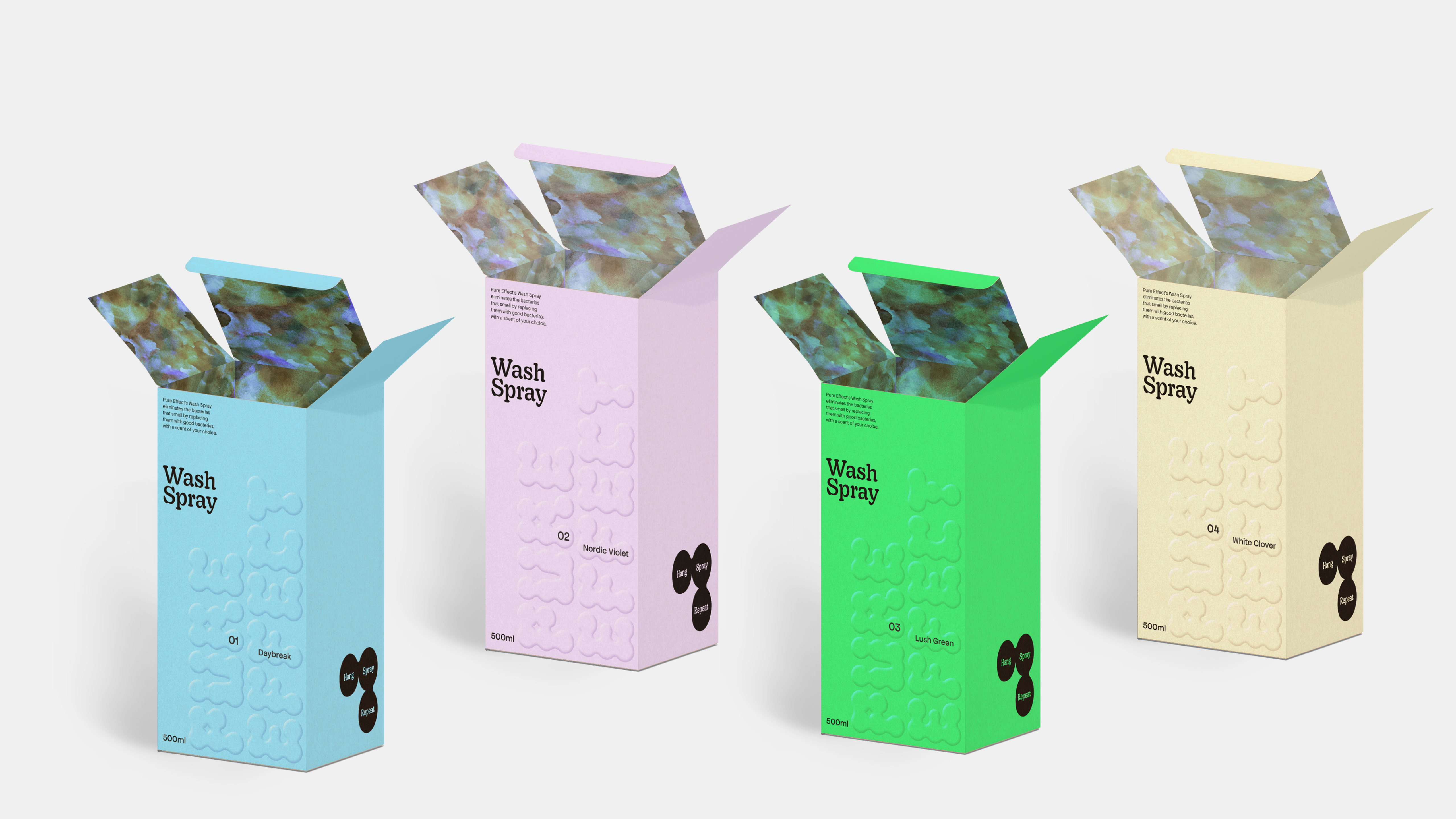
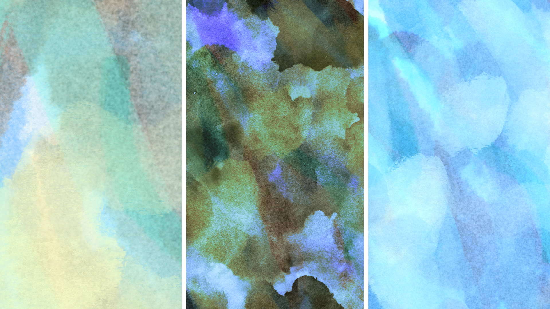
The colors are inspired by the scent notes and names, conveying a sense of freshness and clarity. It should create a contrast with the images and the brown bottle, enhancing its clean and crisp feel.
The colors are inspired by the scent notes and names, conveying a sense of freshness and clarity. It should create a contrast with the images and the brown bottle, enhancing its clean and crisp feel.




Elements
The illustration of bacteria is incorporated, symbolizing the theme that the stain gradually disappears, transitions from dark to light.
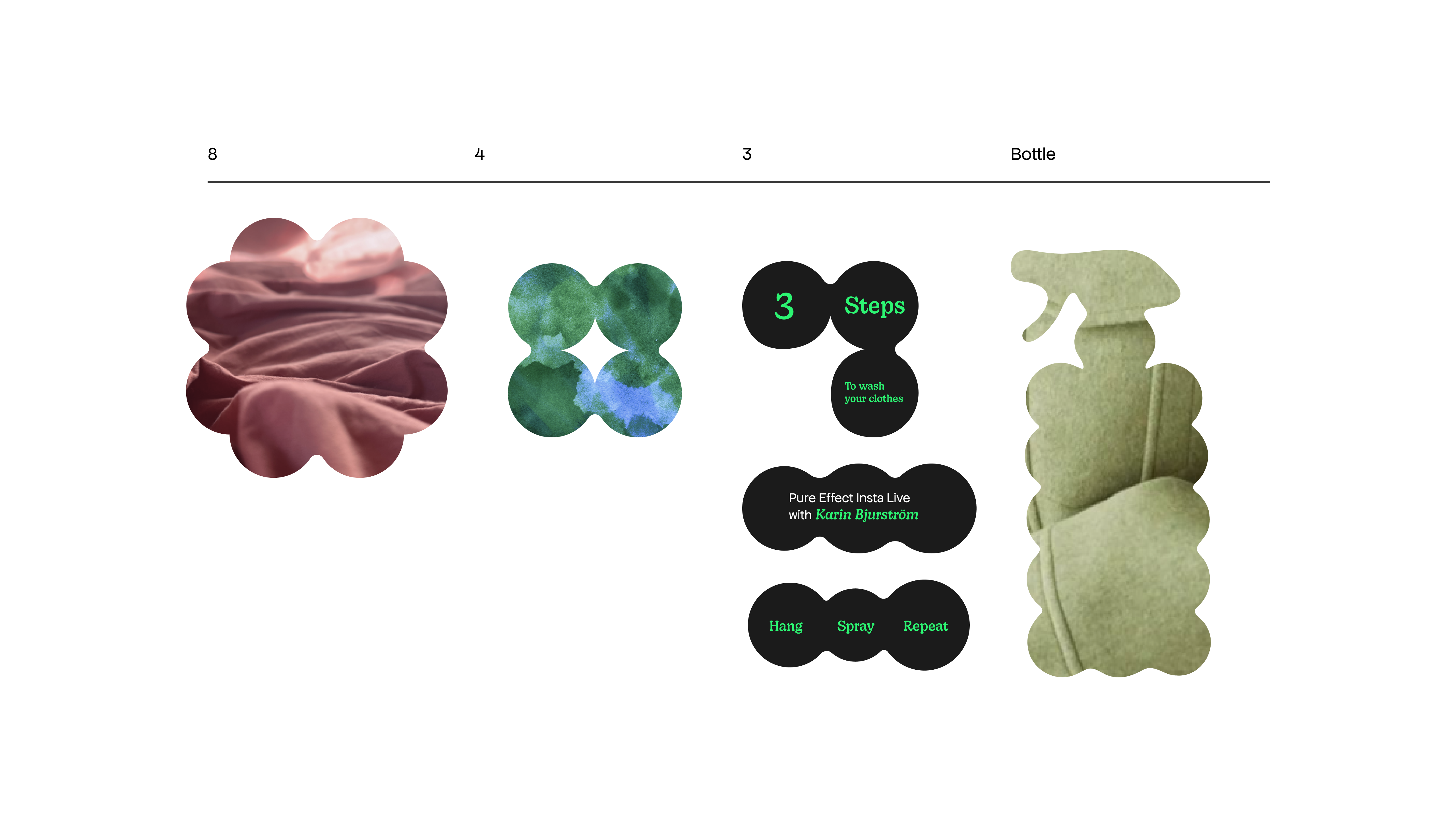
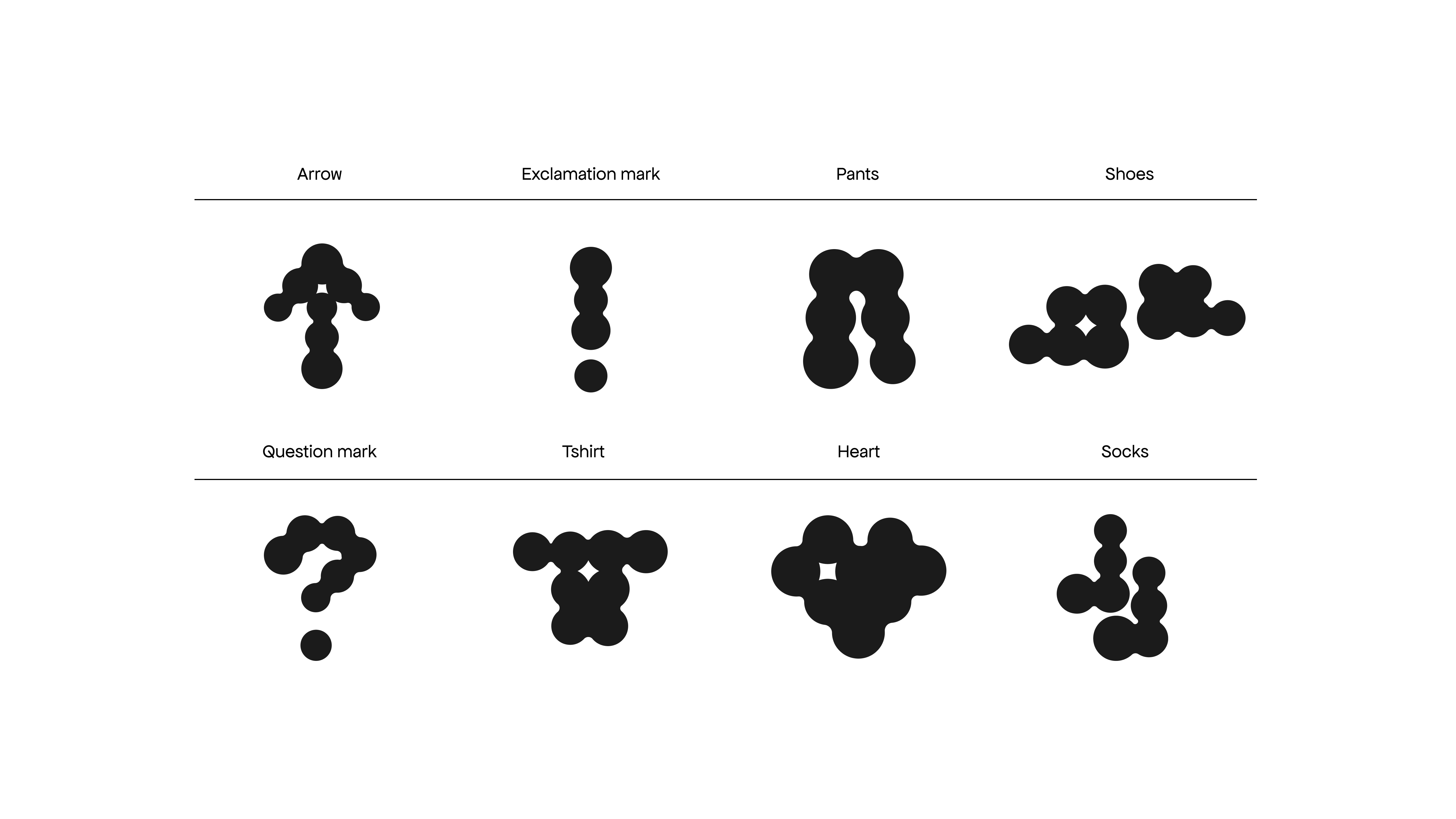
The graphic elements are derived from the logo, with subtle shifts in shape. From one, to many.
The illustration of bacteria is incorporated, symbolizing the theme that the stain gradually disappears, transitions from dark to light.
The graphic elements are derived from the logo, with subtle shifts in shape. From one, to many.
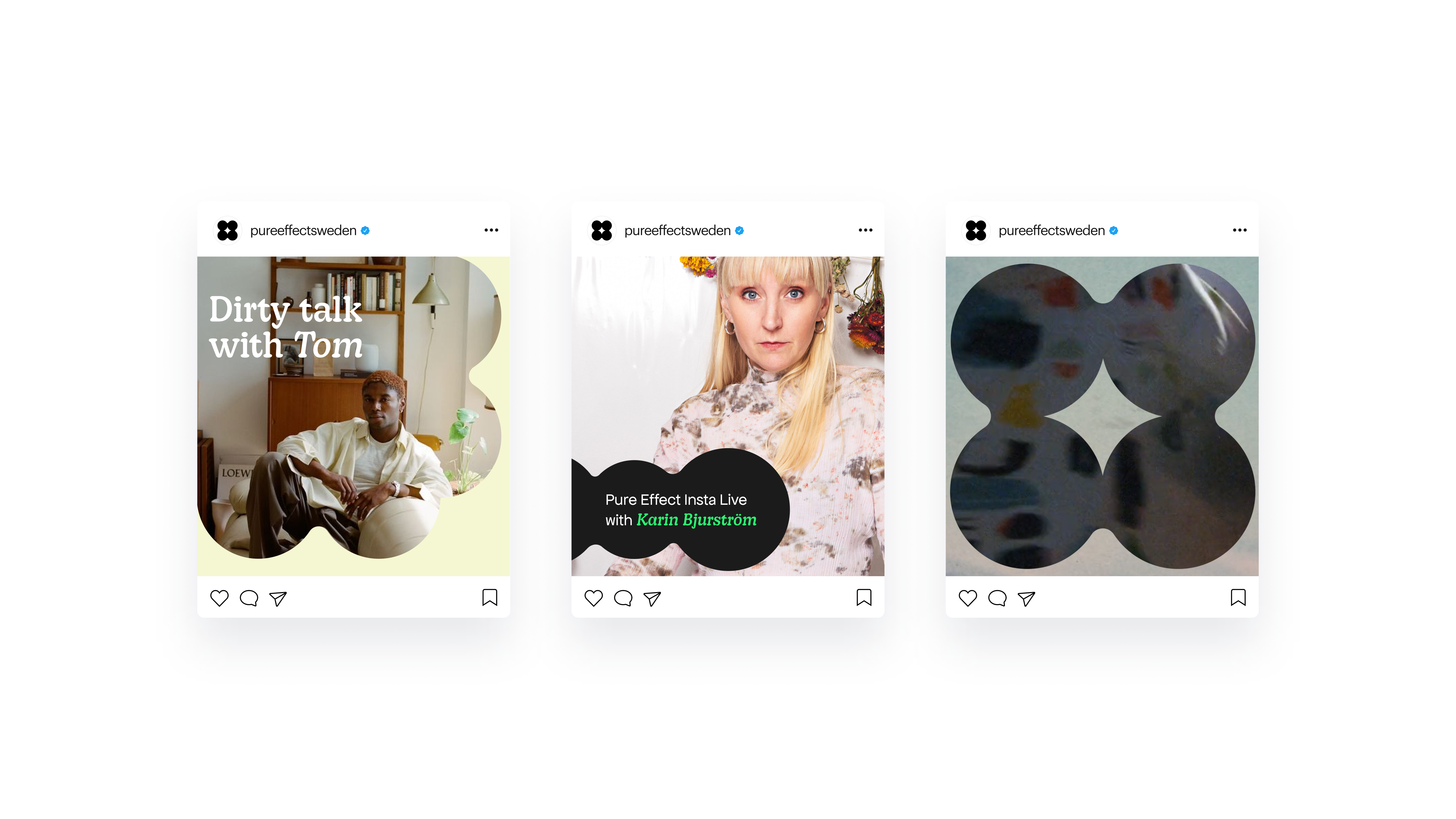
The shapes can be used as an element to be filled with text, photos and textures.
Packaging design
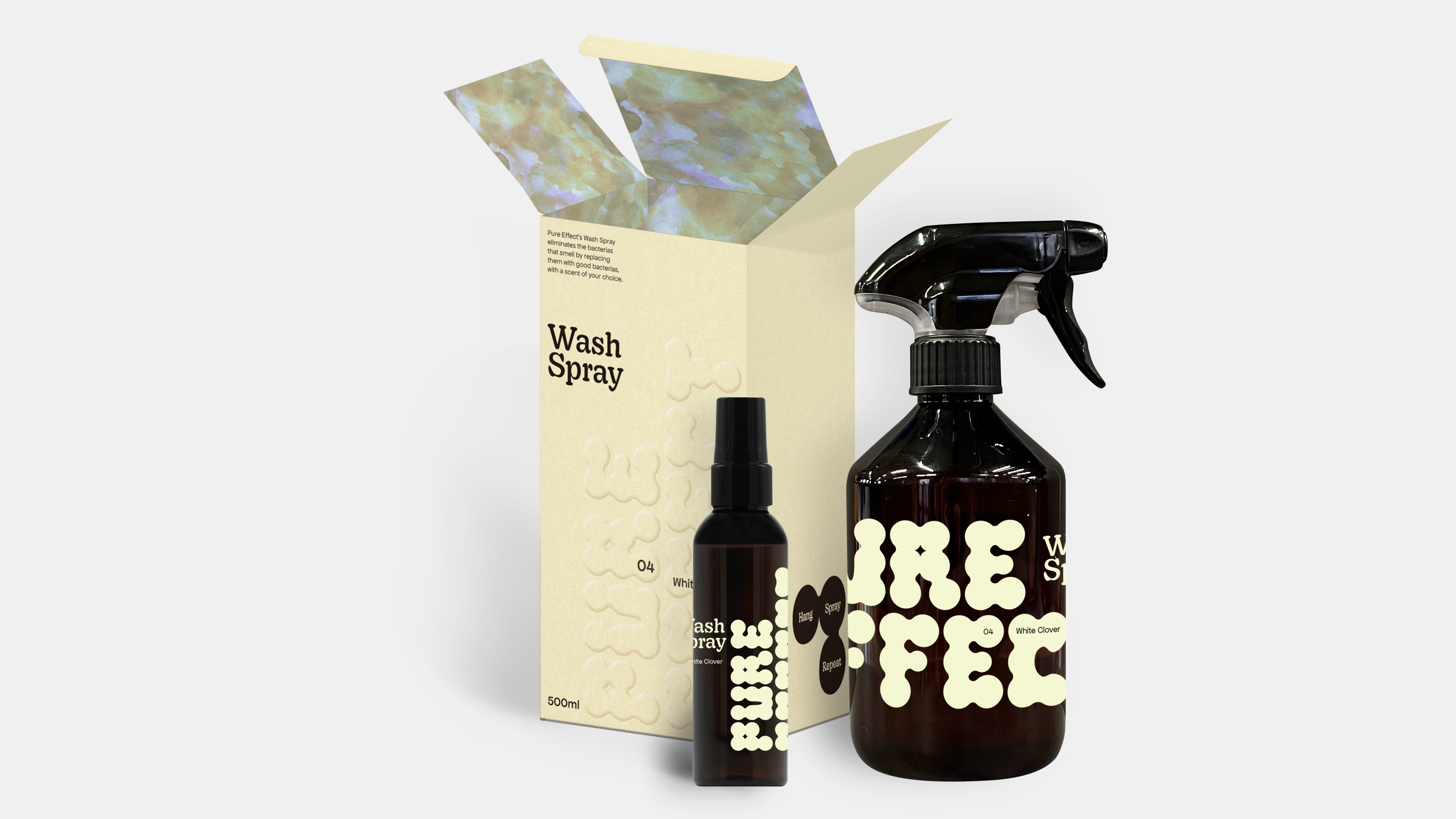
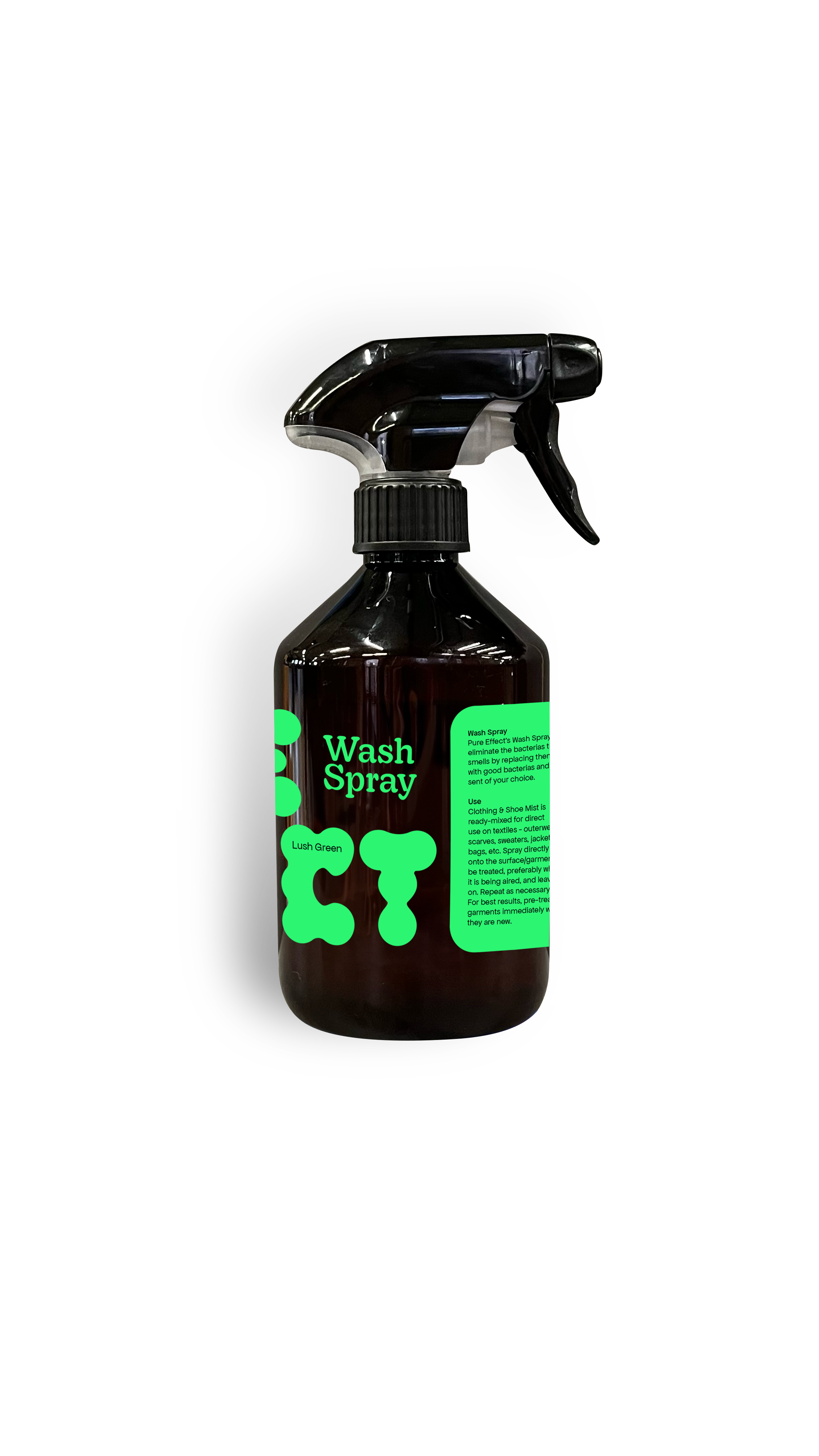
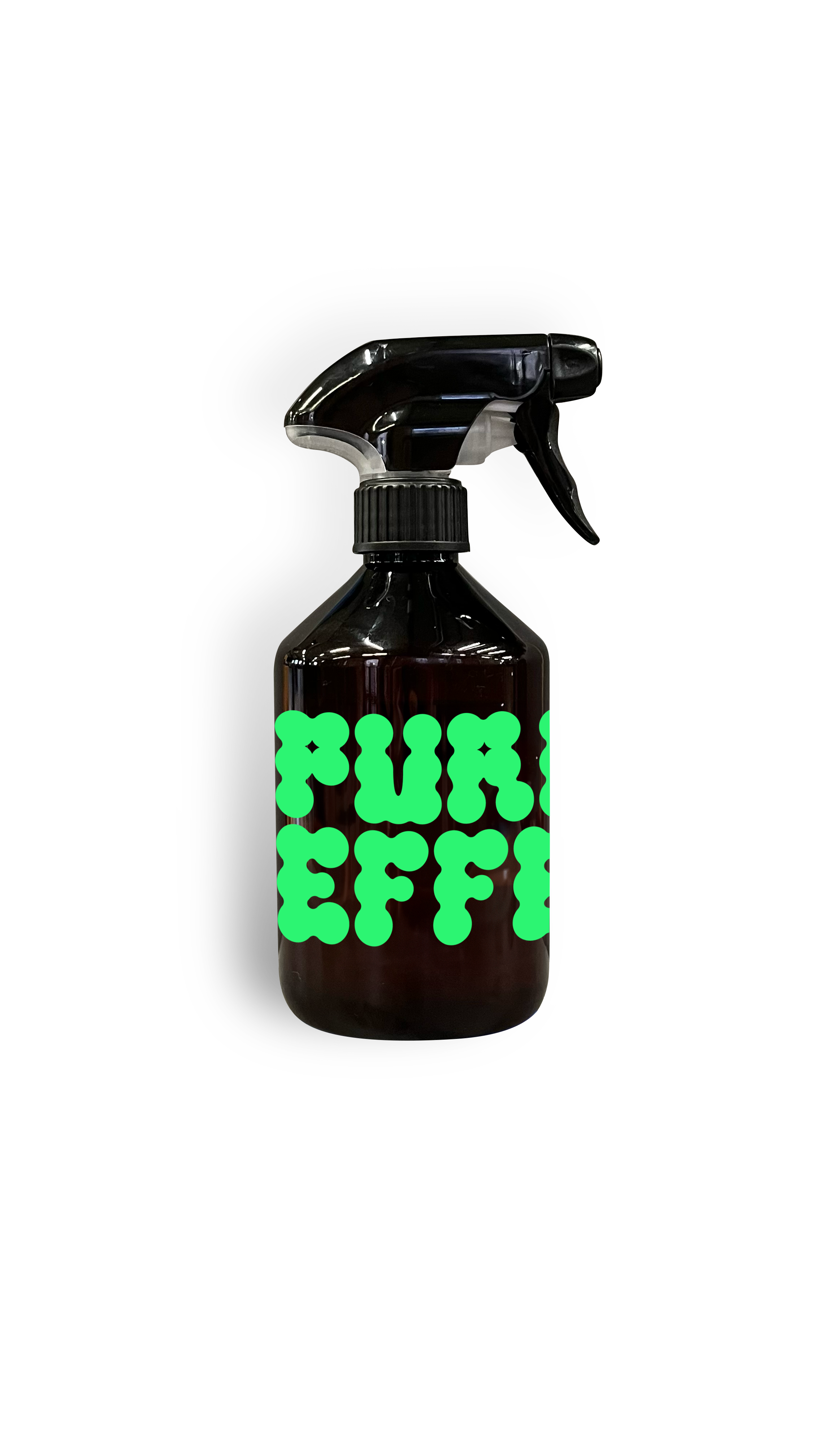
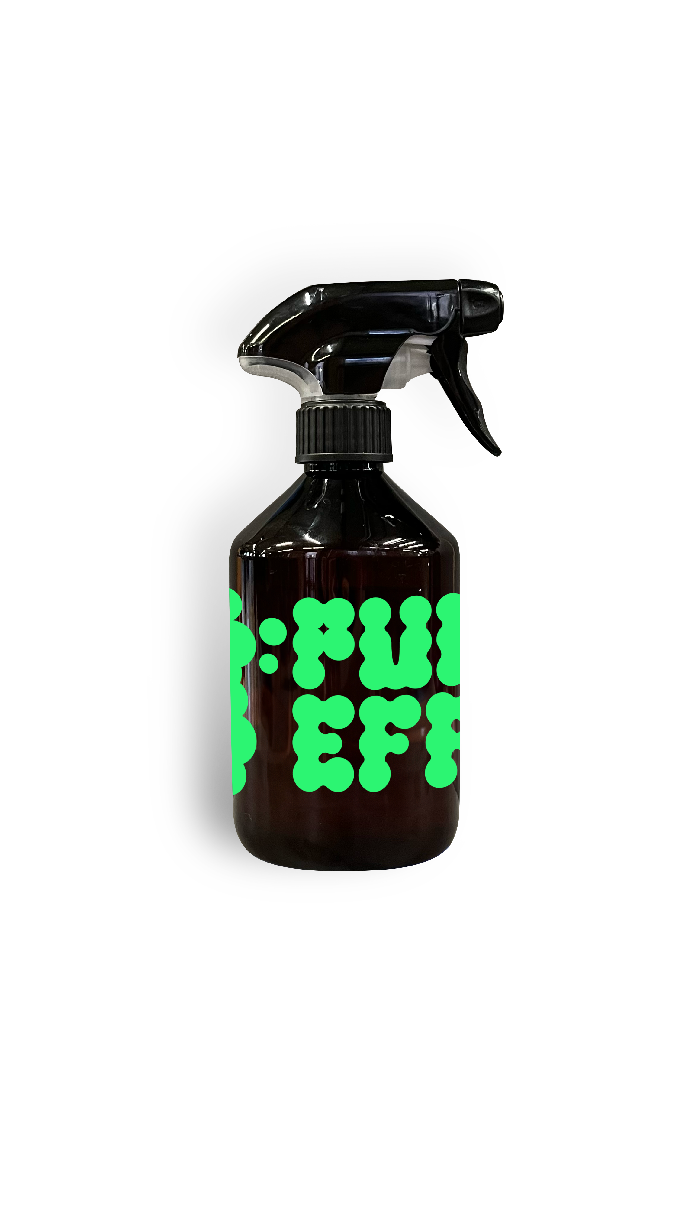
To show the transparency of the brand we choose a transparent label, with the logo printed boldly covering the bottle.
The different scents has it’s own color that contrast the dark brown bottle and comes in a paper box with emboss, showing a small shift in the material.
To show the transparency of the brand we choose a transparent label, with the logo printed boldly covering the bottle.
The different scents has it’s own color that contrast the dark brown bottle and comes in a paper box with emboss, showing a small shift in the material.
